


Introduction
Discussed in Topic 1, researchers question if you can mix the qualitative and quantitative research philosophies together. While mixed data analysis is being done at the professional and academic level, it’s not perfect. There are gaps and challenges you’ll have to overcome. As such, you can think of mixed data analysis and interpretation is an evolving area.
This final Topic serves as a helpful introduction into the world of mixed data analysis. There are several helpful resources on the bottom to continue your understanding of the ideas here. For even more help and knowledge, check out this article for an in-depth look at how structured and powerful this type of analysis can be, from Anthony J. Onwuegbuzie, a pioneer of mixed methods research.
Conducting a thorough mixed data analysis requires time, planning, and sometimes help from stakeholders. But with already short timelines and restless stakeholders, what can you do to make sense of both your qualitative and quantitative data?
Multiple Ways to Analyze Mixed Methods Data
How you analyze your mixed data depends heavily on why and when you’re attempting to mix them. Recall that there are three main types of integration: building, merging, and enriching integration.
If you’re using building integration, that means you have two distinct phases of analysis. You analyze the first set of data to help influence how you collect the second set. If you’re merging the mixed data, you have only one analysis phase — after you’ve collected both sets of data. If you’re enriching one set of data with another, you’ll typically analyze both sets of data at one time, but spend more time making sense of the dominant method/dataset.
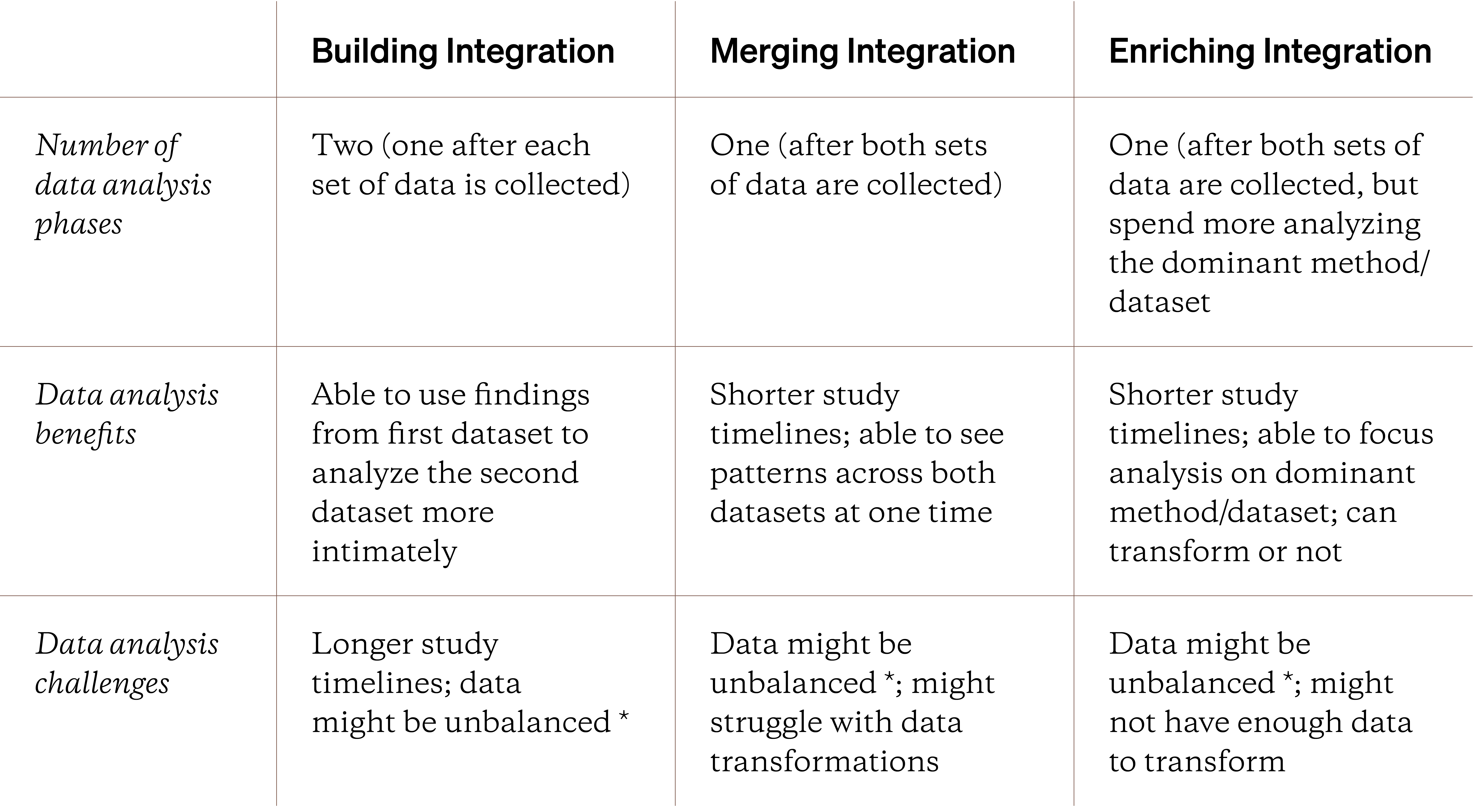
* Unbalanced data means that one set of data might come a handful of participants while the other dataset comes from hundreds or even thousands of participants.
One idea not mentioned in the table above is your personal comfort and experience with qualitative or quantitative data analysis. If you struggle with analyzing quantitative data, your timelines might get longer and your mixed data analysis might suffer.
If you already struggle with analyzing qualitative or quantitative data, your mixed data analysis will be much more challenging.
But mixed data analysis still seems simple? All you have to do is analyze one set of data then the other, analyze both datasets at one time, right? In practice, however, there are different ways to carry out your mixed data analysis. You could analyze the data separately or together, transform one or both sets of data, or create a way to view both sets of data and their patterns at one time. Let’s review these different approaches, starting with the individual approach.
You could also create a joint mixed display. It’s a graphical way of displaying your qualitative and quantitative data together so you can see patterns or communicate integrated findings. Joint mixed displays aren’t currently covered inside the Fruitful research library but you can learn more with this PDF, this article or in Guide 20.
Independent Mixed Data Analysis
The simplest way to analyze your mixed data is pretend they’re two independent datasets. You analyze your qualitative data with traditional qualitative data analysis ( (like with qualitative coding) and, similarly, for your quantitative data, you'd use standard quantitative data analysis techniques.
If you’re new to mixed methods research, analyzing your mixed data independently is a good place to start. If you’re comfortable, you can analyze your quantitative data personally while guiding stakeholders to help analyze the qualitative data. The goal here is to reduce or distill both sets of data into meaningful findings (such as themes, quotes, or descriptive statistics) that you can interpret together.
While this approach is straightforward, it only scratches the surface of mixed data analysis. Below, let’s a take look at data transformations.
Understanding Mixed Data Transformation
What if you could somehow change your qualitative data and findings into a format that allows you to analyze it quantitatively? Or vice versa, what if you could change your quantitative data and findings into qualitative themes?
In mixed methods research, this is known as data transformation. You transform one set of data or findings into another. More specifically, if you transform qualitative data/findings into a quantitative form, it’s known as quantizing. If you go the other way (quant data/findings) into a qualitative form, it’s known as qualitizing. The purpose of transforming your mixed data is to make the follow-up analysis more meaningful; you transform your quantitative data into a qualitative form so you can use qualitative data analysis techniques to make sense of it and vice versa.
Data transformations don’t change your data; just how it’s represented in your data analysis.
Before we look at both types of data transformation, let’s understand what transformation means in this context. First, data transformation changes how your data is represented. It doesn’t mean changing or altering the underlying data/findings at all.

To reuse the 3D glasses metaphor from Topic 1 of this Handbook, you’re viewing your data/findings in a different “color”. You’re not actually changing the underlying “color” in anyway, just how you’re viewing it from behind the 3D glasses. For example, if you viewed something red (like an apple) using the blue lens in your 3D glasses, the apple appears blue. The apple didn’t change color at all but you’re able to notice different details on the apple when you see it in a blue-ish color.
You can also think of data transformation as data translation*. Assume you’re interpreting what someone says from one language to another. If the sentence “the banana is yellow” in English, it’s translated as “el banano es amarillo” in Spanish. You’re not changing the underlying words someone says, just how it’s represented and communicated in another language.*
Keep in mind that if your data/findings are biased, that bias will be carried into data your transformations. You can’t magically transform away bias and issues within your data.
If you have bias in one set of data, that bias will persist even if you transform it.
Why should you care about data transformations at all though? When you analyze mixed data, the act of transforming it from one format to another can illuminate hidden, non-obvious patterns. Such patterns might not jump out at you when you analyze your qualitative data/findings in a purely qualitative manner.
Data transformations also make it easier or more meaningful to take a crossover analytical approach. Coined by Anthony Onwuegbuzie and Julie P. Combs in 2010, crossover analysis further blends the world of qualitative and quantitative research together. It’s when you use analytical techniques meant for one type of research data on data of a different type. For example, you could use traditionally quantitative data analysis techniques (like a significance test) on transformed qualitative data. You can read more it about in this article.
Transforming your mixed data or findings is an evolving area; there’s not a lot of free or easily digestible materials on how to do it in a credible way.
Before taking a closer look at data transformations, it’s important to know that the act of transforming — like with all things research — is beneficial and challenging. Data transformations are an evolving area of mixed methods research. There’s far less materials on how to transform, meaning choosing to transform forces you to take leaps in your data analysis and synthesis. There’s not a ton of accessible (or free) materials online so you’ll find yourself without a lot of support, especially if it’s your first mixed methods study.
Check out the resources linked on the bottom for some more explicit examples of data transformations. While not all the links are related to technology or UX research, they can give you confidence and tips to get started with data transformations.

Finally, you don’t have to transform your data. If you have a ton of qualitative data but very little quantitative data, it’s best not to transform your quantitative data into a qualitative format. Such transformations can lead to skewed or flat out inappropriate conclusions. A crude rule-of-thumb for when to transform is making your qualitative and quantitative data are meeting qualitative and quantitative sample size thresholds, individually (you can learn more about such sample size thresholds in this Topic.
You don’t have to transform your data; it’s up to you and your study goals.
So, how do you transform your data/findings? Let’s start with quantizing your qualitative data/findings.
Quantizing (Qual → Quant) Data Transformation
Quantizing is the act of transforming your qualitative, non-numerical data (typically textual data, narratives, or observations) into a quantitative format (such as descriptive statistics, percentages, ranks, or even into a hypothesis for significance testing. The simplest strategy is to take your qualitative themes (read more about qualitative themes in this Topic) and count how often they appear or exist across all of your qualitative data.
Quantizing is when you transform or represent your qualitative data & findings into a numerical format.
The simplest way to quantize is to first arrive at a set of qualitative findings or themes that directly address your research questions. From there, you’d read thru the qualitative data and mark down each instance of a theme.
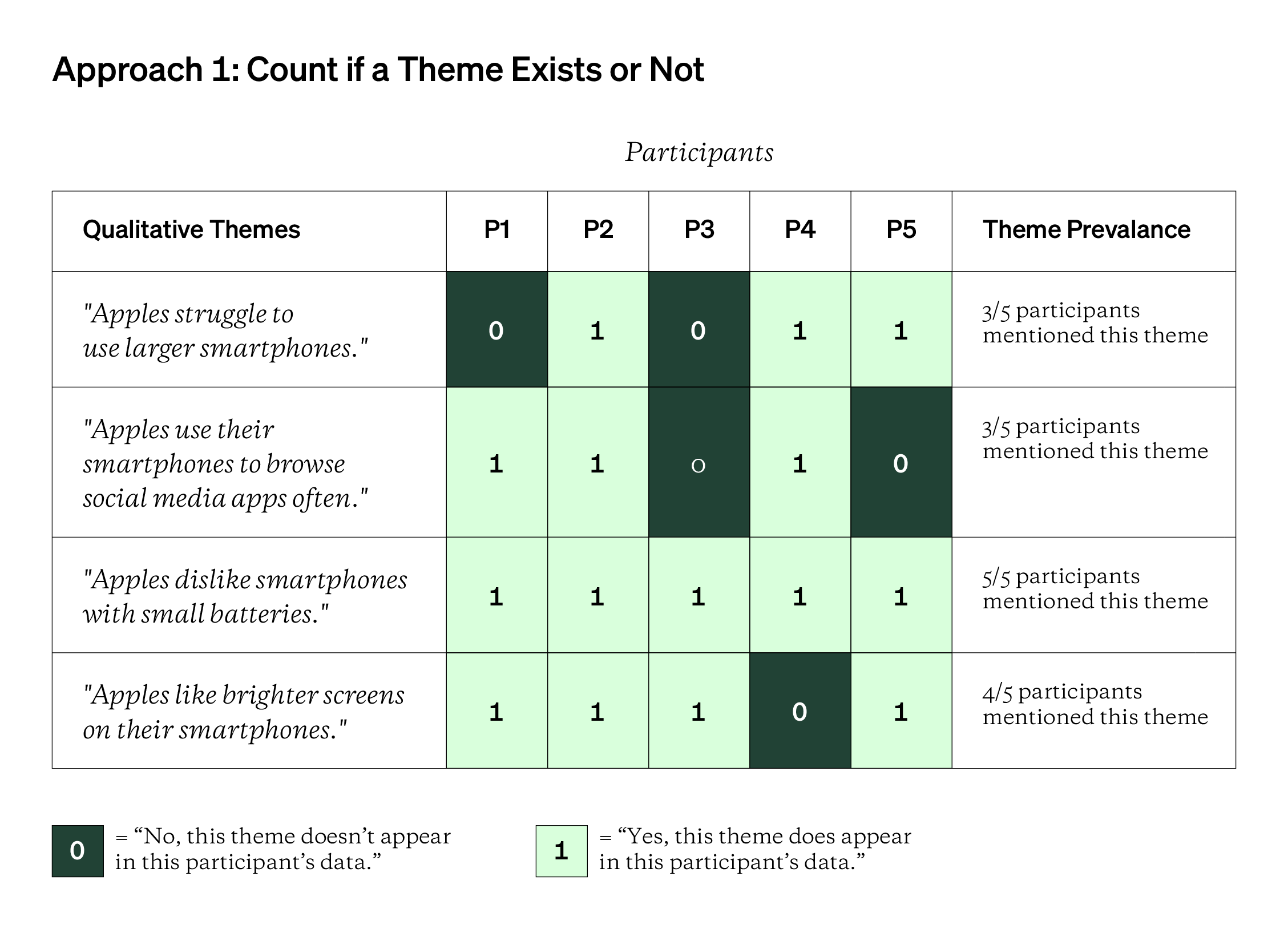
You could either mark down if a theme appears at all (0 for “no, this theme doesn’t appear and 1 for “yes, this theme does appear”) [shown above] or how many times that theme appears within a single participant’s data [shown below]. Either way, you need to be consistent about which approach you take to ensure your quantizing is done credibly.
If you take the second approach below, you could also use relative frequencies (ex: “60% of participants mentioned this theme” or “33% of all major qualitative themes were expressed by this participant).
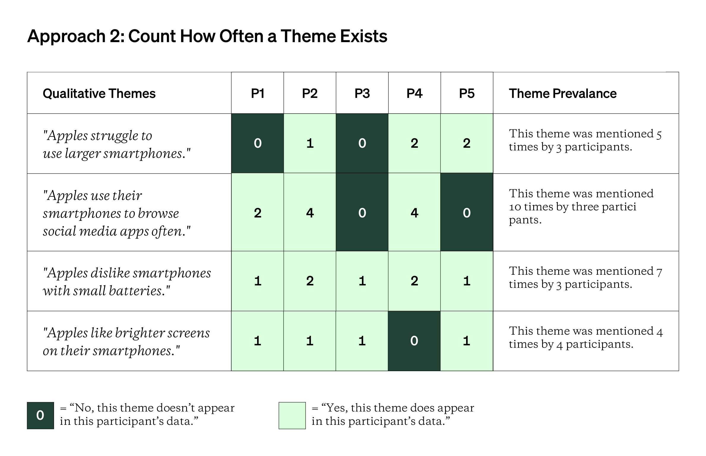
This idea is very similar to the theme-testing chart covered in this Topic on qualitative data analysis. In a theme-testing chart, you’re looking for negative evidence or data that disproves or contradicts an expected pattern. With quantizing, instead of looking for negative evidence, you’re looking for positive evidence or how many times your qualitative shows evidence for a theme. You count up all of the instances of a theme to arrive at theme prevalence or theme frequency, a quantized representation of your qualitative themes.
While counting themes is a lot faster and broad, you could get very granular with your quantizing by counting the instances of each qualitative code or category. However, this process will be more time-consuming and is best done when you have help from stakeholders or colleagues.
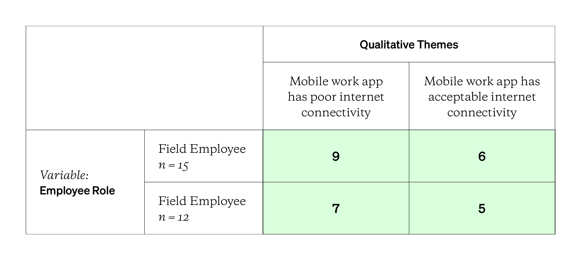
If you’re comparing two or more segments or populations, you could also design table like the one above. You’d repeat the exercise of reading the qualitative data and counting how many participants in each group mention or express the themes. Then, you’d run a chi-square test of association (read more in Guide 12: Using the Chi-Squared Test) to see if there’s evidence of an relationship between the segments/groups and the themes identified and counted. If the chi-square statistic and p-value are statistically significant, you’d have quantitative evidence suggesting a relationship. Such evidence wouldn’t be obvious — or accepted! — from the qualitative data alone.
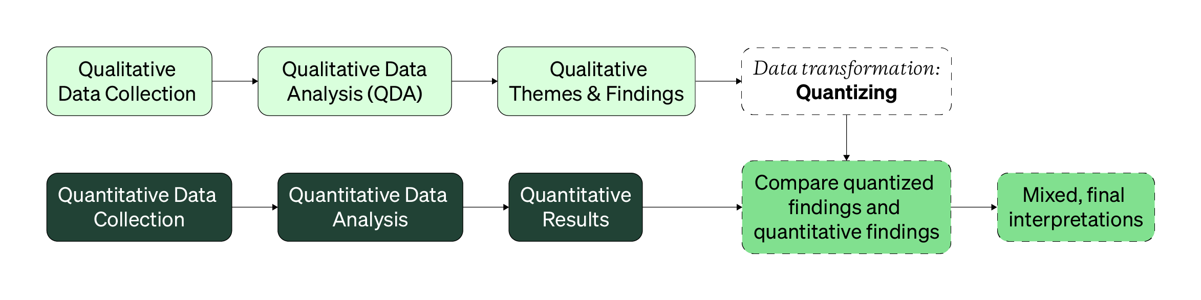
The diagram above showcases where this type of data transformation happens. While you could quantize qualitative findings from an enriching or connecting mixed design, quantizing is best used for merging mixed methods studies, where both sets of qualitative and quantitative data are used to answer the same research questions (looking for agreement and overlap).
While powerful, quantizing has both pros and cons. For example, quantizing can help make qualitative findings become more accepted. Especially for stakeholders that prefer numbers-heavy research findings, quantizing can add weight and credibility to your qualitative findings. Quantizing can also help you conceptualize abstract qualitative findings into variables and hypotheses to be tested in a follow-up (or second strand) research study.
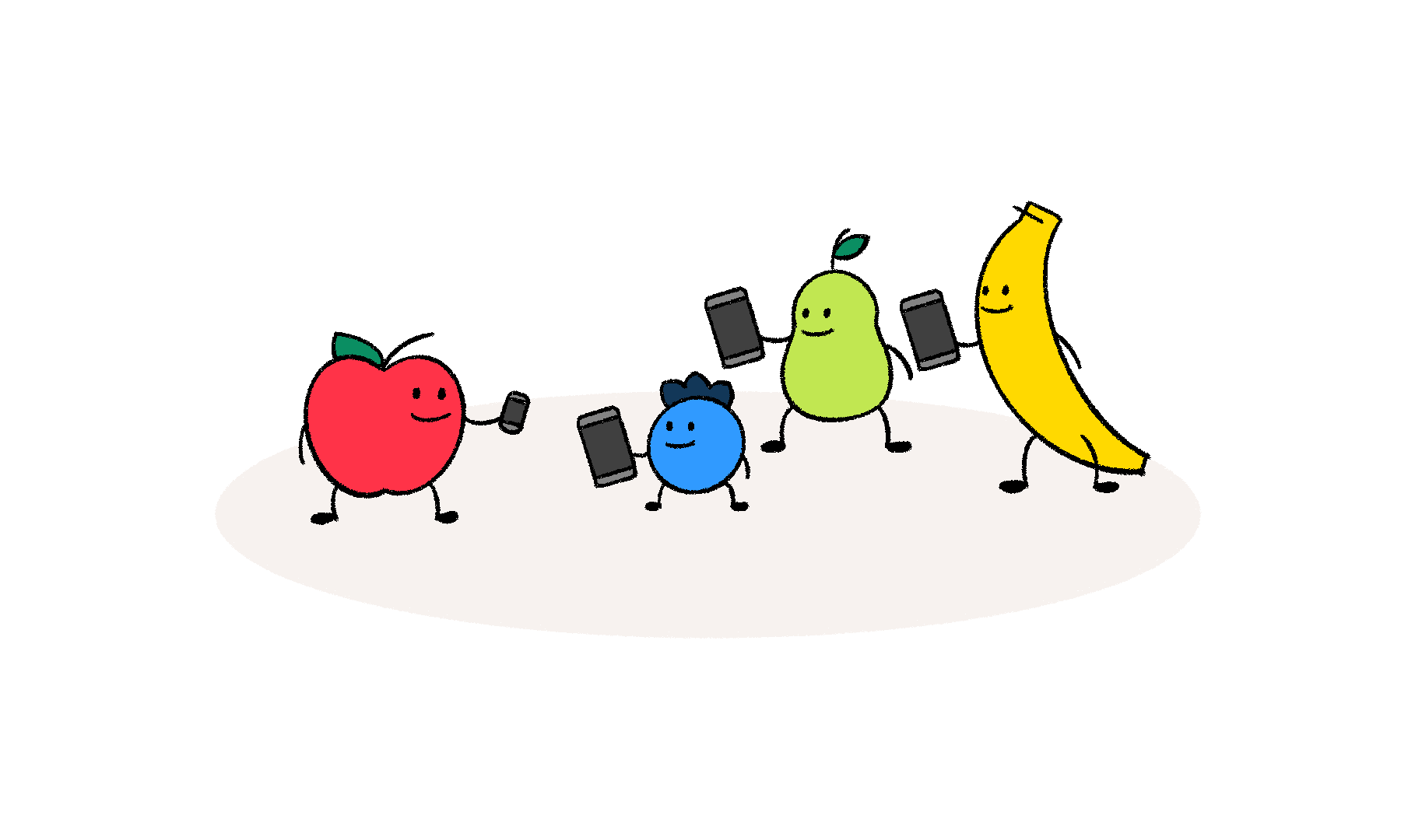
For example, let’s pretend you’re studying how fruits use the internet. After interviews, you arrive at the qualitative theme “apples struggle to use larger smartphones”. You could then test this pattern quantitatively with the variables fruit (with the levels being “apple” , “banana”, “pear”, etc.) and device ownership (with the levels being “large smartphone - 6+ inch display” and “regular smartphone - less than 6 inch display”).
Quantizing can also help you notice patterns in qualitative data that aren’t readily apparent. While you might expect a particularly powerful and emotional theme to appear in every participant’s data, the fact that it doesn’t can be as insightful.
Discussed more in this Topic, don’t use theme frequency as the way only to know what themes to report. A powerful theme might have a low theme prevalence, but it can still be very meaningful to share, like when the only female-identifying participant mentions feeling unsafe in the workplace. Quantizing themes can offer more dimensionality to your qualitative themes but they shouldn’t dictate which themes are reported back to your stakeholders.
On the other hand, quantizing means dealing with a whole new set of challenges as well. First, quantizing means losing detail found in your qualitative data & findings. Qualitative data is nuanced, much more so than a simple tabulation of “yes, this theme exists in this qualitative data” or “no, it doesn’t.” And if you have qualitative data from a small sample size, say less than 5 participants, the act of quantizing can make your data seem more credible than it really is. In some cases, a small sample size can limit or skew any quantitative analyses you might want to use (like the chi-square test of association, which requires at least 5 data points in each cell of a contingency table).
Knowing what, when, and how to count your qualitative data makes quantizing challenging.
An even more pressing challenge is knowing what, when, and how to tabulate your qualitative data. Do themes that are somewhat related (like ”bananas like to regularly eat cookies” and “bananas eat junk food when they’re stressed”) get lumped into one theme or category to make counting easier or should they remain separate? If you’re inconsistent, your quantized results could be meaningless or completely full of error.
Finally, mentioned above, if your underlying qualitative data is flawed, biased, or incomplete, the quantized conclusions you’ll reach will contain those same issues. Numbers are more objective than quotes, yes, but they’re not impervious to bias.
If you want more complex ways to quantize, check out this fantastic paper by Jean Providence Nzabonimpa, a mixed methods researcher at the United Nations World Food Program. Other helpful resources are linked at the bottom.
Now, let’s go the other way: transforming quantitative data into a qualitative format.
Qualitizing (Quant → Qual) Data Transformation
Qualitizing is when you transform or represent your quantitative data in qualitative form. Instead of using numbers, percentages, and decimals, you’d use codes, phrases, sentences, and paragraphs to describe your quantitative results. It’s a qualitative, text-based way of representing, referring to, describing, or summarizing the underlying quantitative data.
Qualitizing is when you transform or represent your numerical, quantitative data & results into a text-based format.
From there, you could analyze this qualitized data using traditional qualitative data analysis techniques. You could also use the qualitized data to help verify if your interpretations of quantitative data are sound.
Currently, there are two popular ways to qualitize your quantitative data: by creating profiles or by running a factor analysis. Covered more in this Topic, a factor analysis is a quantitative analysis technique that helps you reduce multivariate quantitative data into the fewest number of variables that explain the variation or patterns across that data. While the math of running a factor analysis is heavily numerical and technical, the labelling or naming of the factors is open to interpretation, context, and experience. Such labelled factors can represent qualitized findings as you’re assigning constructed meaning to numbers.
A narrative profile is a synthesized, interpretive description about the quantitative data from a particular group of participants.
The other way is to create profiles by grouping together participants and their quantitative data together. For example, all of the respondents who clicked “very satisfied” on a survey could have their data grouped together. Then, you’d write a narrative profile or qualitative description, summary, or narrative about this “very satisfied” group of respondents. The profile could be entire sentences or discrete codes, categories, and themes — it depends on how granular and complex your quantitative data are.
The narratives generated are from your perspective, not the participants themselves. Be cautious of the language you use in your profiles. Recognize that your interpretations are colored and that different researchers might interpret the quantitative data differently. Use as much of your collected qualitative data to help flesh out or validate your quantitative-based narrative profiles.
You can also group together different sets of participants to create different profiles, as outlined in the table below (based on descriptions from mixed methods pioneers, Charles Teddlie & Abbas Tashakkori). You can read more in this article (on the bottom of page 68).
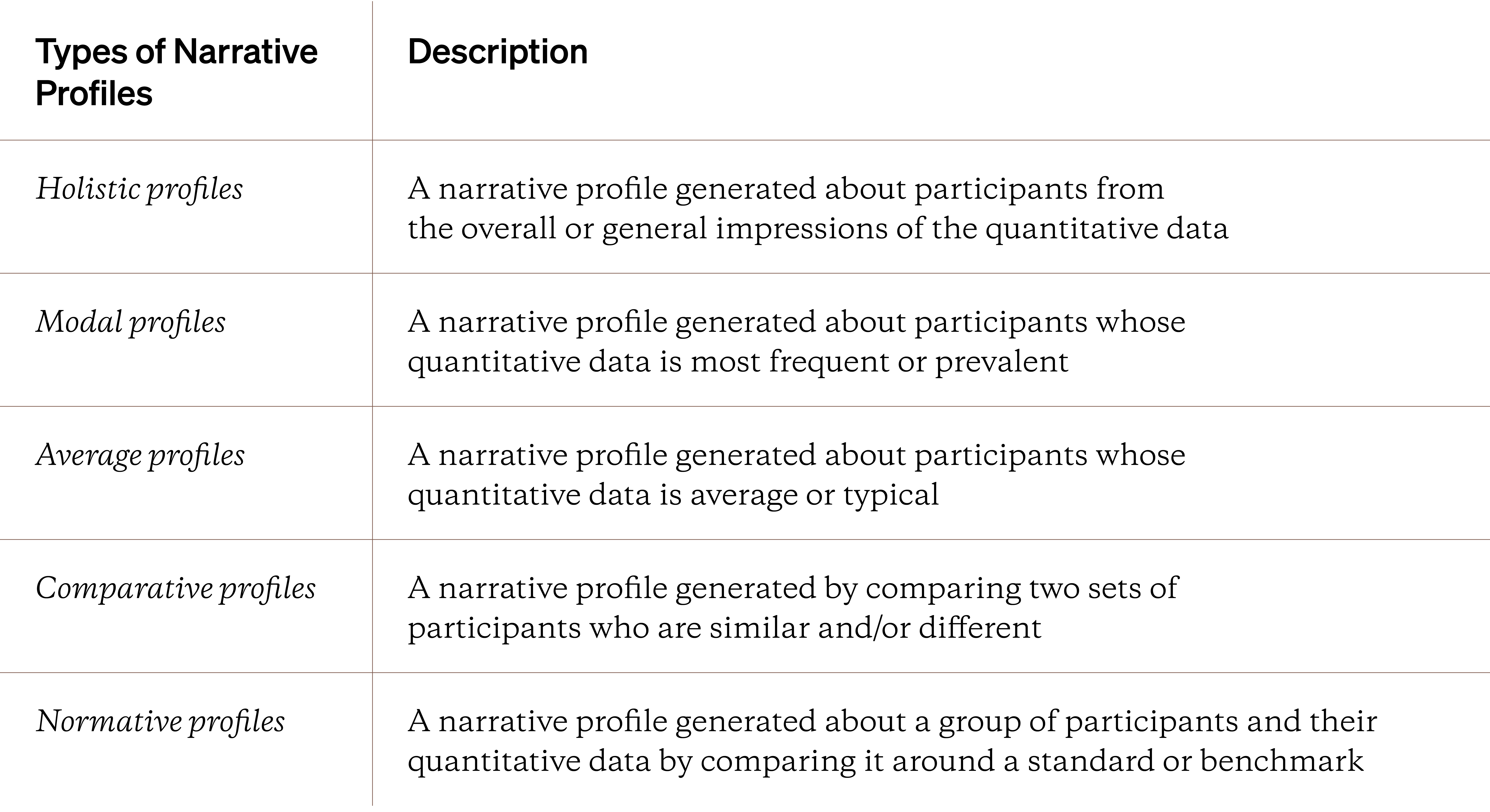
Please note that narrative profiles don’t only mean literal paragraph descriptions. You’d be hard pressed to write multiple paragraphs from a single histogram. Typically, a narrative profile can be generated by stringing together multiple simple phrases or sentences (like “struggles with time management” or “uncomfortable with upselling” after a quantitative survey on retail employees). With enough quantitative data and the subsequent qualitized themes or findings, you could generate a meaningful and distinct set of narrative profiles that describe one or more groups from your mixed methods study.
You can also generate multiple narrative profiles for a single set of quantitative data. However, more profiles don’t guarantee a meaningful mixed methods study. Be selective about when and what kinds of narrative profiles you generate.
However, while there are many profiles you can generate from your quantitative data, the fundamental issue is that you, the researcher, are using your personal lens to make those profiles. You’re constantly making decisions to focus on or exclude certain quantitative data. If you want to generate an average profile, what exactly is average? Or with a holistic profile, how do you know your impressions and understanding of the quantitative data are accurate, reliable, or meaningful?
Quantizing is challenging because you must use your subjective, constantly changing personal lens to view static or fixed quantitative data.
Quantizing is more common than qualitizing for many different reasons. One reason is that unlike qualitative data, quantitative data is tends to be more objective and descriptive. You can, more or less, explicitly count the number of times a particular qualitative theme appears across all your data.
You can read more about the realist research philosophy that fuels quantitative research here).
However, it’s a lot harder and more prone to error to find constructivist (qualitative) meaning within your quantitative data. Experience, context, and your relationship to the quantitative data can make finding qualitative meaning slow and taxing.
In general, literature and established practices around qualitizing is somewhat sparse and there’s a lot of debate around the most valid or reliable ways to qualitize. How do you assign qualitative meaning to quantitative data & results? You can’t easily code your statistics or notice subtle differences in tone, cadence, behavior from a histogram or bar graph. You can’t use computers or software as easily as you might with quantizing your qualitative data. And if done poorly, qualitized findings might might over-represent or under-represent the underlying quantitative data and the participants who provided that data.
Similar to qualitative data analysis or with constructivism, two different researchers might come to different interpretations. The numbers and results might be static, but how you make sense is dynamic and changing. Rely on your context and judgment of your quantitative results to generate themes instead of expecting deep, latent themes to magically pop up.
To end this mixed methods handbook and Topic, let’s look at one final idea: the fact that your qualitative and quantitative findings could directly contradict each other.
Merging: Disagreement, Agreement, and Silence
The assumption you make when you mix methods is that your results will generally help you understand the research question deeper than using one method alone. But what happens if your interviews tell you one thing and your survey results tell you another?
Even if you have non-overlapping strengths and weaknesses, it’s not a guarantee that your mixed methods findings will tell you one cohesive story. Commonly used for merging where you’re looking for agreement and similarities but the idea can still affect other types of mixed methods studies: something that seemed big or true in one set of data is different or missing in the other set of data.
Agreement, disagreement, or silence have multiple names in the field of mixed methods research. For example, confirmation, expansion, or discordance are also used in the literature (Fetters et al., 2013).
The qualitative and quantitative findings from a mixed study aren’t guaranteed to overlap or be consistent.
Agreement is likely what you’re aiming for when you mix methods. It’s when findings from one method are backed up or confirmed by the other method. It’s as if both methods and their findings are ‘telling the same story’. Typically, if you have agreement, then your findings are more credible, giving you greater confidence in your results.
Silence is when one or a set of findings show up in one method, but not the other. This isn’t necessarily a bad thing because it’s possible that you’re learning about ‘different but related parts of a story’. For example, you might learn through interviews people talk a lot about being comfortable while watching media content on their phone, while never seeing this want expressed in a closed-ended survey.
Disagreement is when findings from one method contradict or conflict findings from another method. For example, if your survey results showed that everyone loved your company’s app but zero interview participants talked about loving the app, then you might have disagreement in your mixed methods findings. The list below offers some ways to handle disagreement or silence.
Handling Disagreement or Silence with Mixed Final Interpretations & Findings
- Review one or both strands to see if bias or blunders affected the findings (such as not being consistent or credible with data transformations, not meeting sample size requirements, comparing two very different, unrelated samples, etc.)
- Analyze the mixed data separately (if analyzed together during one strand)
- Have other researchers, designers, or stakeholders help review the data (to establish reliability and consistency or challenge if disagreement/silence truly exists)
- Triangulate findings with other past data or findings (like with log data or product analytics, past reports, external secondary data like industry or market reports)
- Consider if disagreement or silence is evidence of the mixed final interpretations and findings being more complex or interconnected than initially assumed
- If at all possible, re-run the same mixed design as two independent studies to see if both set of findings agree or overlap
However, the strategies above aren’t perfect. If you’re already struggling to align, plan, and execute a mixed design, you might not have the time, resources or most importantly, stakeholder support or enthusiasm to handle disagreement or silence. You might be forced to move onto the next research study or topic. However, you can mark down contradictions and issues and look to address or investigate them throughout other studies that deal with the same population or segments.
And keep in mind, disagreement or silence isn’t inherently a bad thing. People and their relationships with products are a complex, inconsistent thing. Emotions, attitudes, and needs fluctuate over time and no single mixed methods study can capture all of that complexity. Use silence and disagreement as a way to invoke conversation amongst stakeholders and product partners. Leaning into ambiguity can position your research findings — and yourself! — as an important tool for asking better, deeper conversations about the people you’re building for and the products the company is creating.
Closing Thoughts
There are so many advantages to designing and running a mixed methods research study. As explored in this Handbook, there are several popular study designs you can use. It’s up to you, the researcher, to make sense of the research questions you want to address and select the most appropriate strategy. With time and practice, you’ll find it second nature to propose a viable mixed methods approach
But what happens when you know what approach you want to take? Do you stop planning your study and start collecting data? The three most robust data collection methods were already mentioned in this chapter: interviews, surveys, and usability tests. But how do you improve your skills in each? What is the hidden side of each, and how do you know what issues to avoid? In the next Phase, Collect, you’ll find a deeper look into these three methods and learn how to collect less but better data.
In the next Collection, let’s go through some common research methods and how best to maximize them.
- Concurrent mixed analyses
- Meta-inferences
- Crossover analysis framework (CAF)
- joint mixed data display
- Sequential mixed analyses, conversion mixed analyses, multilevel mixed analysis, fully integrated mixed analyses, and crossover mixed analyses
- Parallel-tracks analysis; crossover-tracks analysis
- Extreme case analysis
- Content analysis; domain analysis
- Constant comparison method
- Mc-Nemar for repeated measure sequential designs
- Narrative profile formation; modal profile; holistic profile; comparative profile; average profile; normative profile
- "Developing Mixed Methods Crossover Analysis Approaches" (article)
- "Crossover Mixed Analysis in a Convergent Mixed Methods Design Used to Investigate Clinical Dialogues About Cancer Treatment in the Japanese Context" (article)
- "On Quantitizing" (article)
- "Joint displays for mixed methods research in psychology" (article)
- "The Mixed Methods Research Workbook" by Michael D. Fetters (paid book)
- "Visuals in joint displays to represent integration in mixed methods research" (article)
- "Joint Displays to Facilitate Integration of Qualitative and Quantitative Research" (presentation)
- "Guidelines for Conducting Mixed-methods Research: An Extension and Illustration" (article)