


Theme-Data Fit
Themes are powerful because they can both summarize and represent the meaning in your qualitative data. But you need to make sure your draft themes fit your data, not only how you’ve coded and categorized.
A draft theme is a theme that’s yet to be validated. Sometimes, your themes might appear to be powerful and illuminating representations of the rich, underlying qualitative data. But without validating this assumption, your qualitative themes might be distorting or leaving behind valuable patterns in your data.
The diagram below shows the range of possible outcomes when testing how well your themes fit your data.
On the left side, you have your themes matching your raw data completely. A perfect fit is nearly impossible due to the act of coding itself. Themes you generate are general patterns designed to give abstracted meaning, while your qualitative data is always specific. This means themes can only do a reasonably good job of fitting your data, but you’ll always generate themes that don’t fit all of your qualitative data.
Moving right, is where themes and the raw data match well enough. Your themes reasonably capture the meaning for most of your qualitative data. In your theme-testing chart (covered at the end), you have mostly blank cells. You can feel confident that your QDA was done well when you’re in this zone.
Next, is where your themes don’t fit your data well. This isn’t necessarily a bad thing because, with closer inspection, you might be able to recognize patterns missed during your initial QDA process.
Keep an eye out for “outlier” data or data that doesn’t fit the general patterns you see. “Outliers” can help put your entire analysis into perspective, allowing you to reshape your themes (like the "Temporary" category in the mattress shipping example from Topic 2), even if it can be time-consuming.
Finally, on the far right is the zone where your themes and raw data contradict each other. Essentially, the way you’ve coded, categorized, and themed your qualitative data is far removed from the meaning within that data. In this situation, you’ll want to manually check each code and category — or possibly redo all your coding — and form more appropriate themes.
You want to avoid this situation because it can mean starting your QDA process again from scratch, a costly mistake. You want to feel confident in your codes, categories, and draft themes before testing to avoid repeated or timely work.
This begs the question: how exactly do you test themes?
The Switch: Inductive-to-Deductive
The QDA process starts as inductive. Your code, categorize, and theme in an iterative process. But when you test draft themes, you switch to a deductive approach. Instead of asking yourself, “what meaning is within your qualitative data?”, you switch your question to “Is this theme a good fit for the meaning within your qualitative data?”
“Is this theme a good fit for the meaning within your qualitative data?”
If you answer “yes,” you can consider a draft theme validated. If not, you might have to recheck or restart the entire QDA process (this is one reason that keeping an analysis journal and a codebook can help – you can review your process to spot mistakes in your thinking).
Guide 11: Using an Analysis Journal
Don’t spend unnecessary time rereading your qualitative data when testing themes that are poorly or inappropriately generated. You'll spend time you don't have and it won't be a fruitful task.
Some examples of themes that you should hesitate to validate are:
Qualitative Themes to Avoid Testing
- Themes that artificially reduce the messiness/complexity within your data
- Themes that are based primarily on vivid, outlandish, or extreme anecdotes
- Themes that are too subjective, biased or only on single individual’s experiences
- Themes that dismiss or ignore data that contradicts itself
- Themes that were generated after a very rushed, un-iterative QDA process
Even if you’ve generated themes by closely following the QDA process, there’s a chance each theme is so far removed from the raw data that themes are either meaningless or woefully skewed.
The deductive approach to validation requires you to have a skeptical mindset. Be a scientist. It can be hard not to confirm what you’ve already done, but the greatest insights come when you’re actively trying to disprove yourself.
Trying to disprove yourself is the best way to recognize unexpected, insightful patterns in your data.
The best way to disprove yourself and test themes is to go back and review your qualitative data using a theme-testing chart.
The Theme-testing Chart
A theme-testing chart is a structure designed to help you test draft themes and possibly recognize even more valuable themes. Below is an example of a theme-testing chart used when understanding online gamers’ communities.
Let’s break down the various elements so you can use or modify this chart to fit your needs. First, at the very top, is the qualitative research that you set out to study. It’s listed at the top to keep you focused on what themes and patterns you’re trying to generate.
Next, underneath the research question, are your draft themes. In this example, there are four draft themes that were generated after coding, categorizing, and theming this fictional data. A good rule-of-thumb is to make your themes as short and as simple as possible. If you struggle to see all of your draft themes easily, it’s a good indicator to reword and condense them further.
On the left-side are your participant details. The first column represents the ID or number of each participant. The next column lists all of the relevant, important details about each participant (such as those in your Most Informative Participant, MIP, definition). These details will make it easier for you to see patterns across and within themes and participants.
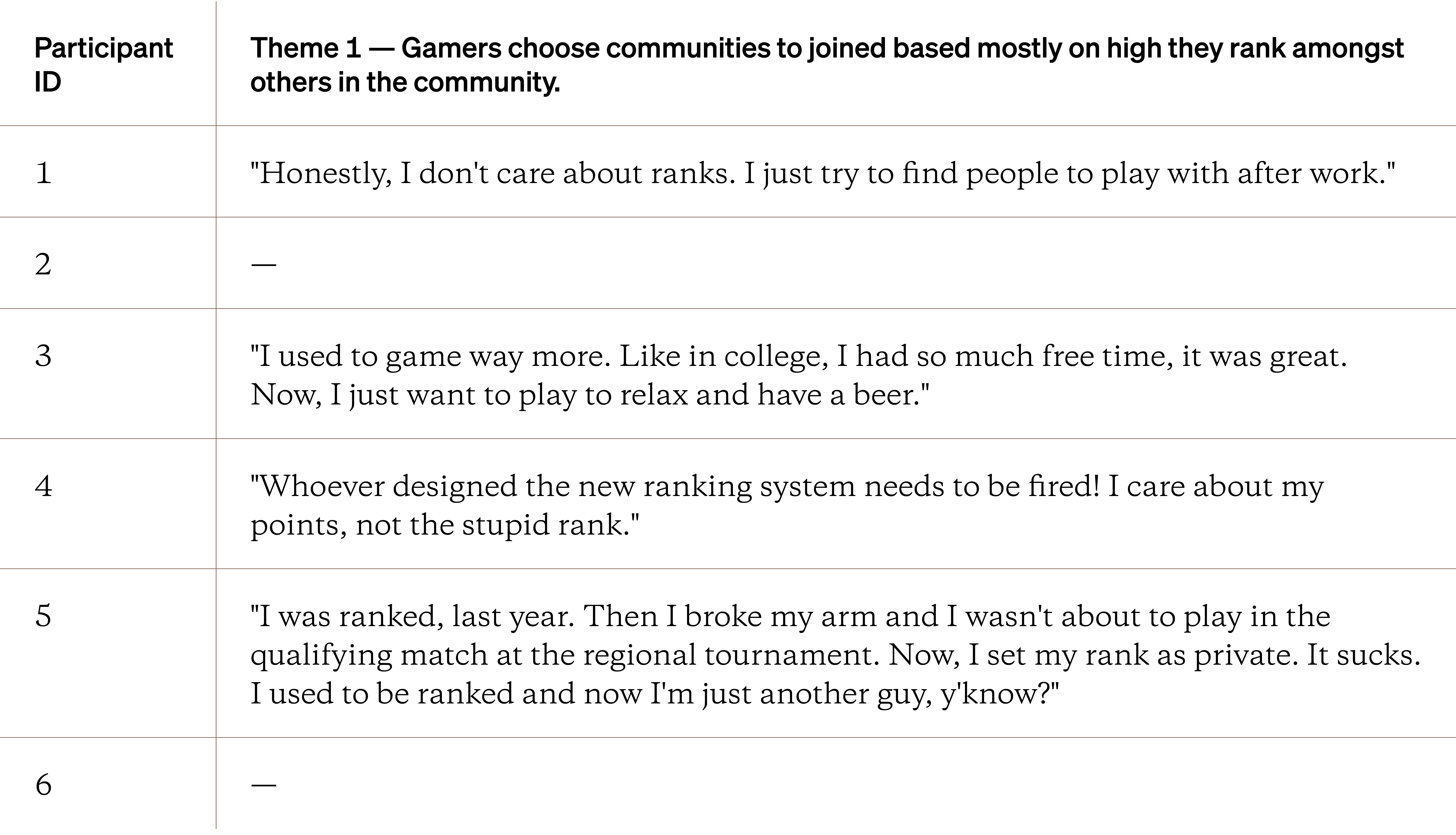
The largest section of a theme testing chart is for negative evidence. Negative evidence is any data that challenges or contradicts a draft theme. It can also represent the lack or absence of a theme that was expected.
To use the chart, you reread your structured and cleaned qualitative data. Every time you find evidence to challenge or contradict a particular draft theme, copy/paste or add in the exact qualitative data into the chart.
Repeat this process until you’ve reread all your data and tested all of your themes. As you reread and negative evidence, keep track of your thoughts in your analysis journal.
Guide 11: Using an Analysis Journal
At the end, any blank cells in a column imply there wasn’t any negative evidence for a particular draft theme. An entire column a column of blank cells imply that this theme has been validated and it fits your qualitative data. Keep in mind, that themes are general while your qualitative data is specific. You’ll always have some negative evidence in your theme testing charts.
The goal isn’t to have a perfectly blank chart but a chart that helps you better understand your qualitative data. You can, however, get to a point where you find less and less negative evidence. You should expect slight iterations between your themes and your testing, as you finally end with a handful of themes that you can confidently report out.
Every theme testing chart will have some amount of negative evidence.
If you want to move faster, involve your team, and get some more objective results when testing themes, have your stakeholders fill out a copy of the chart as well. It can take some time, but fresh eyes can either validate that these themes fit the data or expose you to non-obvious patterns you hadn’t considered. You can also use the guide below to test themes. Read more about member-checking in this Topic or the guide below.
Guide 13: Member-checking Qualitative Findings
Handbook Closing Thoughts
Qualitative data analysis is one of the most powerful tools you use as a researcher when done appropriately. It helps you connect with the data, defend your findings with ambivalent stakeholders, and make it easier to notice hidden or obscure patterns. Even if you don’t have fancy software, you can still move quickly and gather true meaning from the people you’ve learned.
Qualitative data analysis (QDA) requires you to be focused, methodical and patient. On the other hand, software tools can help you move much faster with your quantitative data. But how do you make sense of the hundreds - if not thousands - of data points you might get from a single survey? In the next handbook, let’s break down the basics of quantitative data analysis.
- Deductive coding
- Theme validation