

Describe and Summarize
Describing your data is the best place to start when analyzing your quantitative. While your context changes, descriptive statistics will be useful every time. Descriptive statistics is when you use numerical values to summarize or represent a data set.
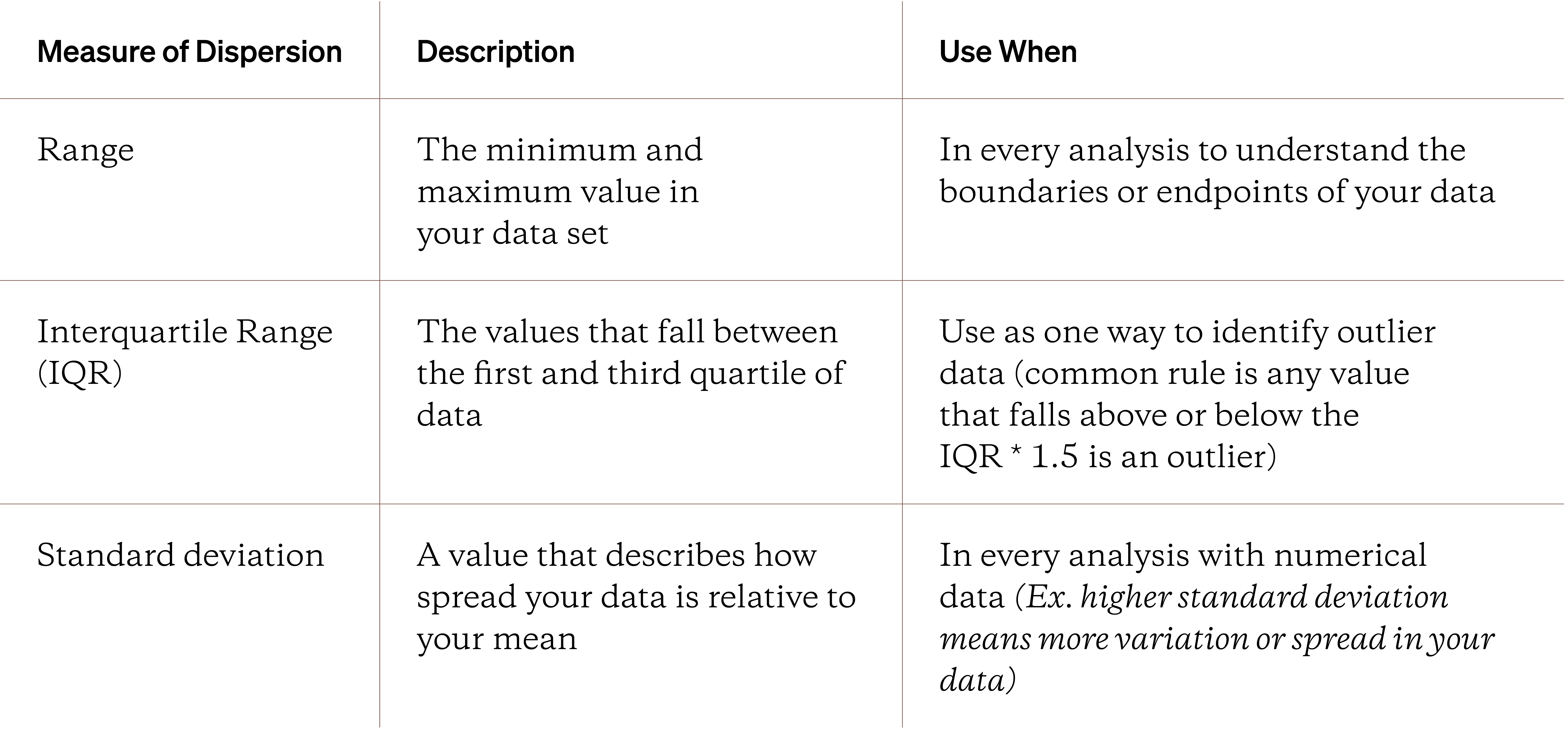
The most common descriptive statistics are the central tendency and the measures of dispersion. The central tendency is made up of the mean, median, mode and range. The measures of dispersion are include ideas like variance, standard deviation, and skew.
Cluster and Dispersion
When you have lots of quantitative data, you’ll find that it clusters around certain values. With ratio data, your data clusters around the mean. Examples of ratio data include things like task completion times or average basket price for online orders.
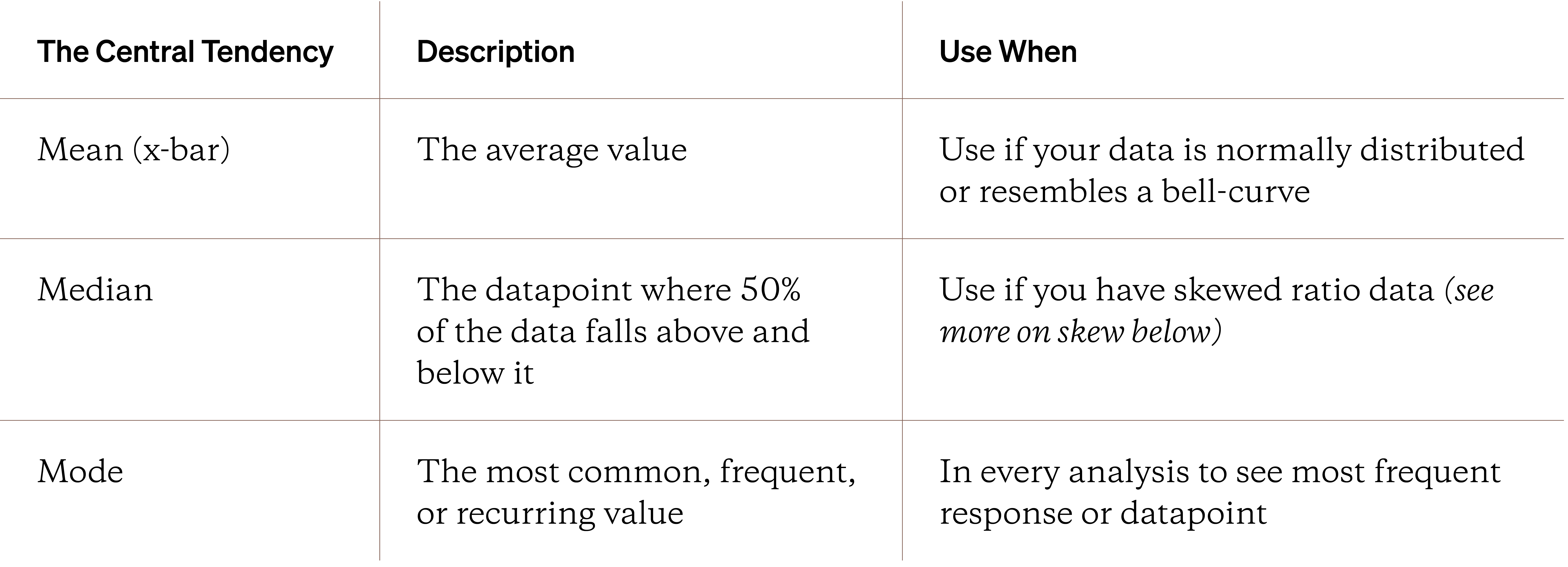
While the central tendency describes how clustered your ratio-level data are, measures of dispersion describe how spread out it is.
While the central tendency, measures of dispersion, and summaries are important, the ideas aren’t very helpful for categorical data. And quantitative experience research - especially in immature and unstable research cultures - means mostly collecting categorical data. So what can you do? A great place to start is by looking at frequencies.
Displays: Frequency & Contingency tables
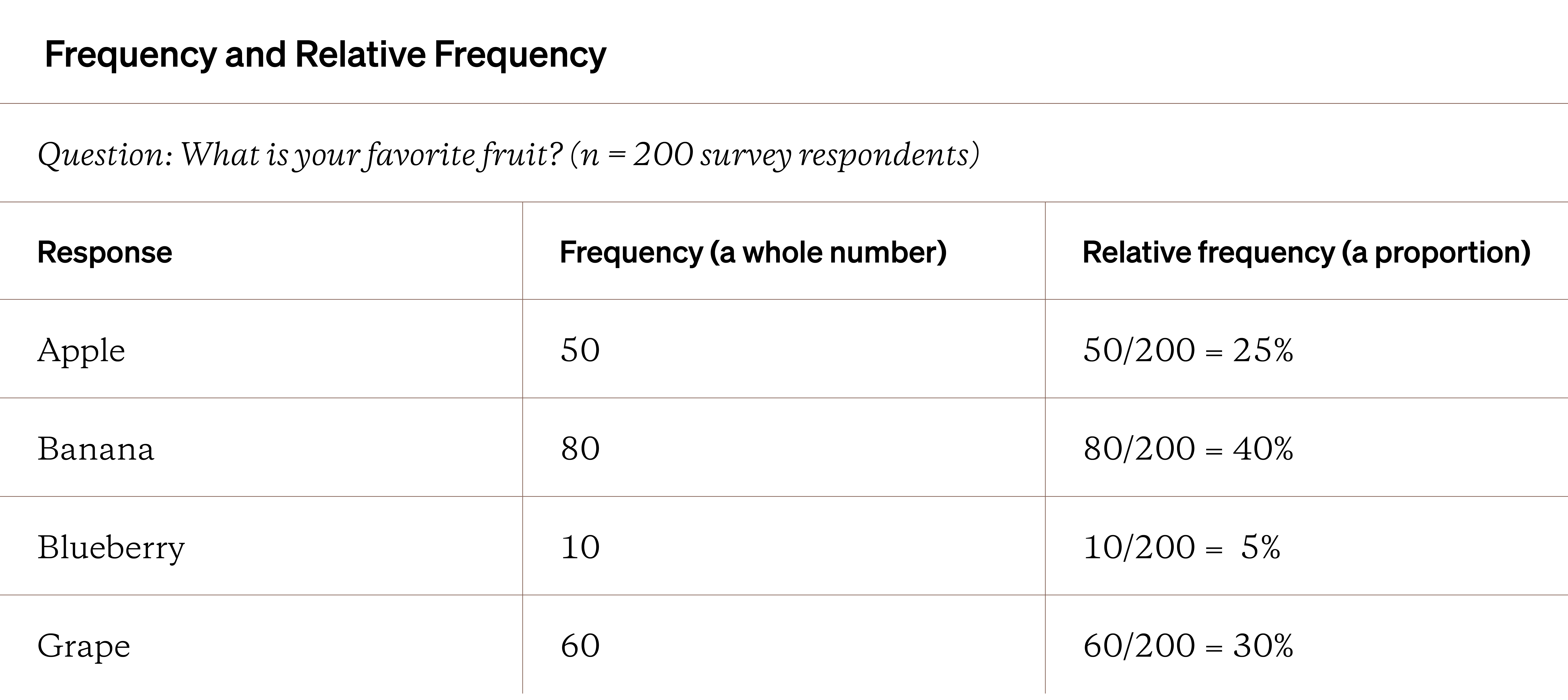
Frequency is how many times a response or datapoint occurs in your dataset. It’s always a whole number. A relative frequency is how much a particular response or datapoint occurs as a proportion of the entire dataset.
If you added up all the relative frequencies, you should end up with 100% of your data being represented. The example table below shows the difference when looking at survey data about what are people’s favorite fruits.
The table above is one example of a display, a visualization that makes patterns and relationships easier to recognize or understand. While the frequency table above is a helpful display, it’s not going to help when you have lots of variables.
Instead, you should try to make a use a contingency table (also referred to as cross-tabulations or cross-tabs). You can view frequency data for two or more variables within this display easily. Let’s look at an example of a contingency table in action.
The frequency table below shows the data from the survey question “What mobile operating system (OS) do you use?” Let’s assume this question was asked to participants after they participated in an experiment for a week.
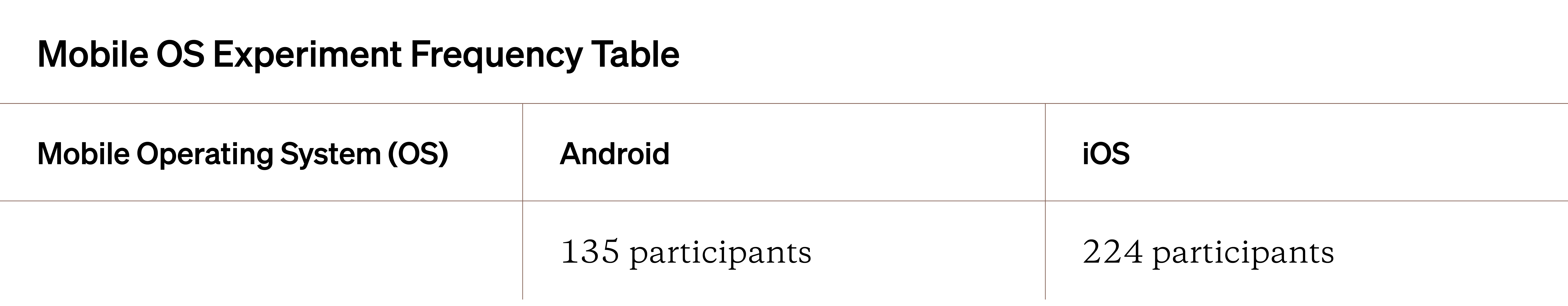
At first glance, this table isn’t very helpful or even interesting. However, things get more interesting when adding additional variables, going from a frequency table to a true contingency table. Let’s add the recorded app behavior (as a relative frequency) during this experiment to the table and see what stands out.
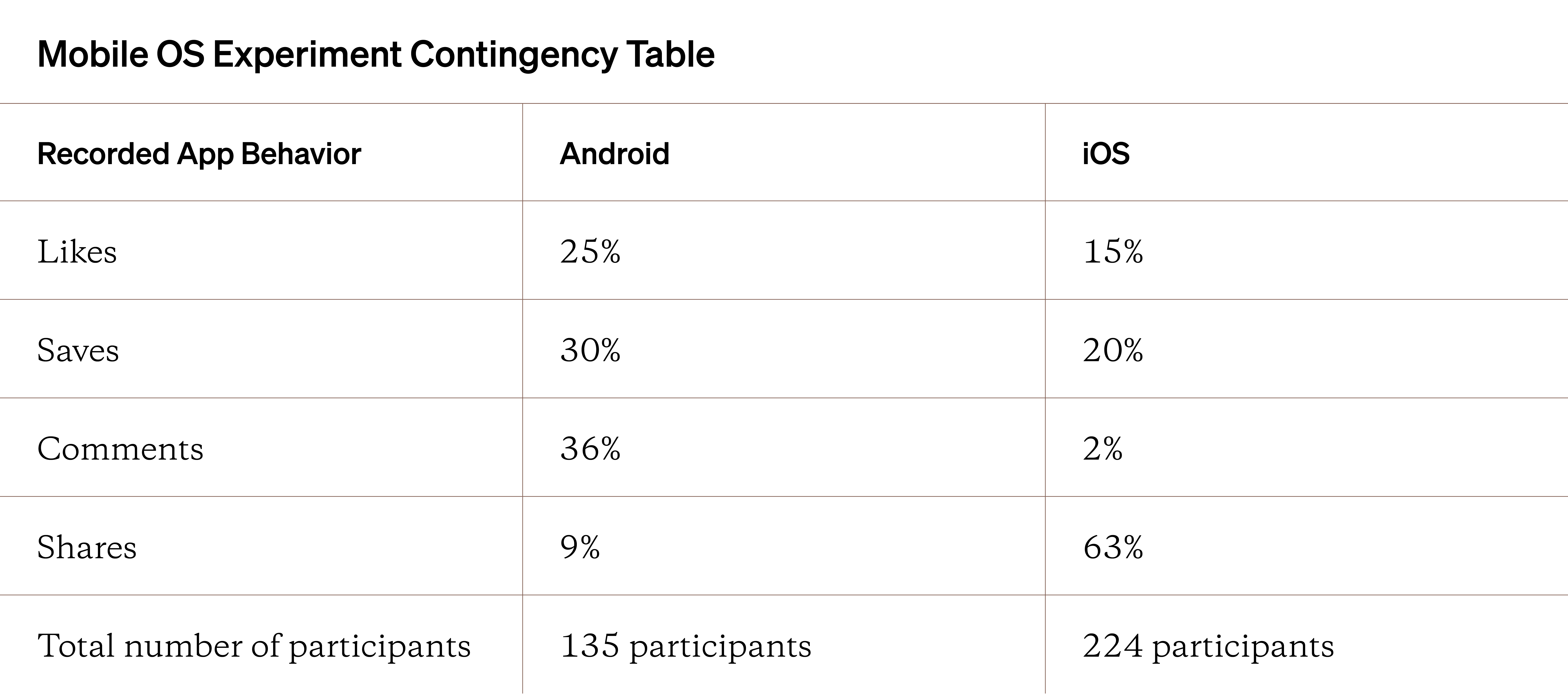
Very quickly, you can start to see some interesting patterns. For example, iOS owners seem to share way more than Android owners. Android owners also seem to comment more frequently (perhaps reviewing other experiment data can help explain why).
Even adding one extra variable/column helps you make sense of this data. With enough questions or variables in your data, you can create helpful contingency tables to identify patterns among important variables, going from one for variable-variable pair to the next.
You can also create contingency tables with more than two variables. While it can be harder to create and read, the granularity you can see can be useful to focus your analysis on some variables while ignoring others.
Ideas like skew are hard to see in displays and numerical statistics but it can be very obvious when you graph your data.
Graphical Description
When you need to get a broader look at your data, you’d want to switch to graphical methods. This includes making and viewing diagrams, charts, or plots. The bar chart and histogram are two of the most common and robust graphs used across quantitative studies. Other graphs for quantitative-numerical data are listed below.
Helpful Graphs for Quantitative-Ratio Data
- Histogram
- Scatter plot
- Q-Q plot (quantile-quantile plot)
- Box-and-whisker plot
Sadly, there are more powerful graphs for quantitative-numerical data than quantitative-categorical data. That doesn’t mean categorical graphs aren’t powerful. Let’s look at both histograms and bar charts below.
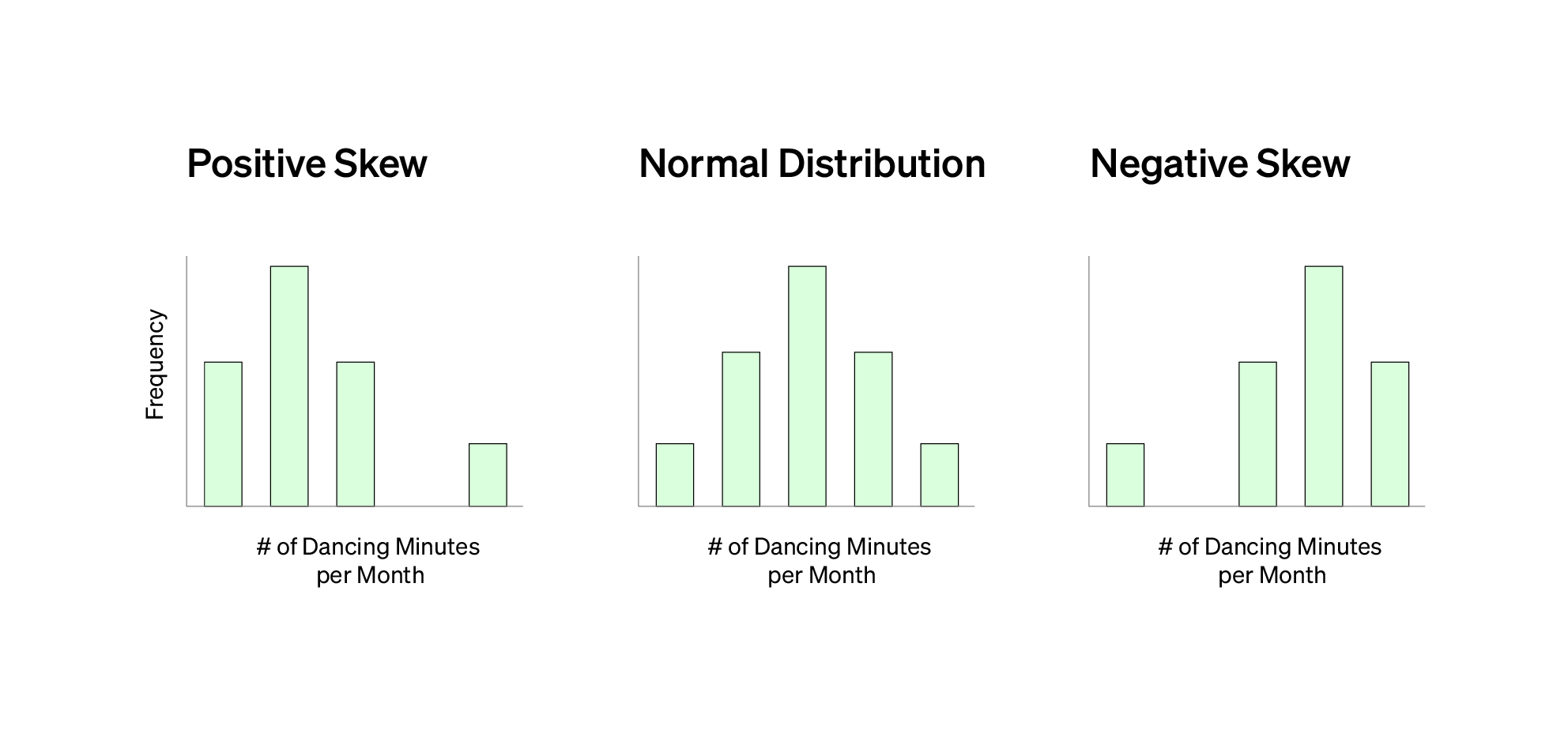
Let’s pretend that you had a sample size of 100 survey respondents. In the survey, you asked every fruit just one question: how many minutes a month do you dance? Respondents entered their answers in minutes. You graph your survey data to see the data distribution.
The data distribution represents not only the range of answers for this one question but how many times each answer was given. In this example, the data resembles a normal or bell-shaped distribution. You might also see your data be skewed as shown below.
If you have categorical data, you would use a bar chart instead of a histogram.
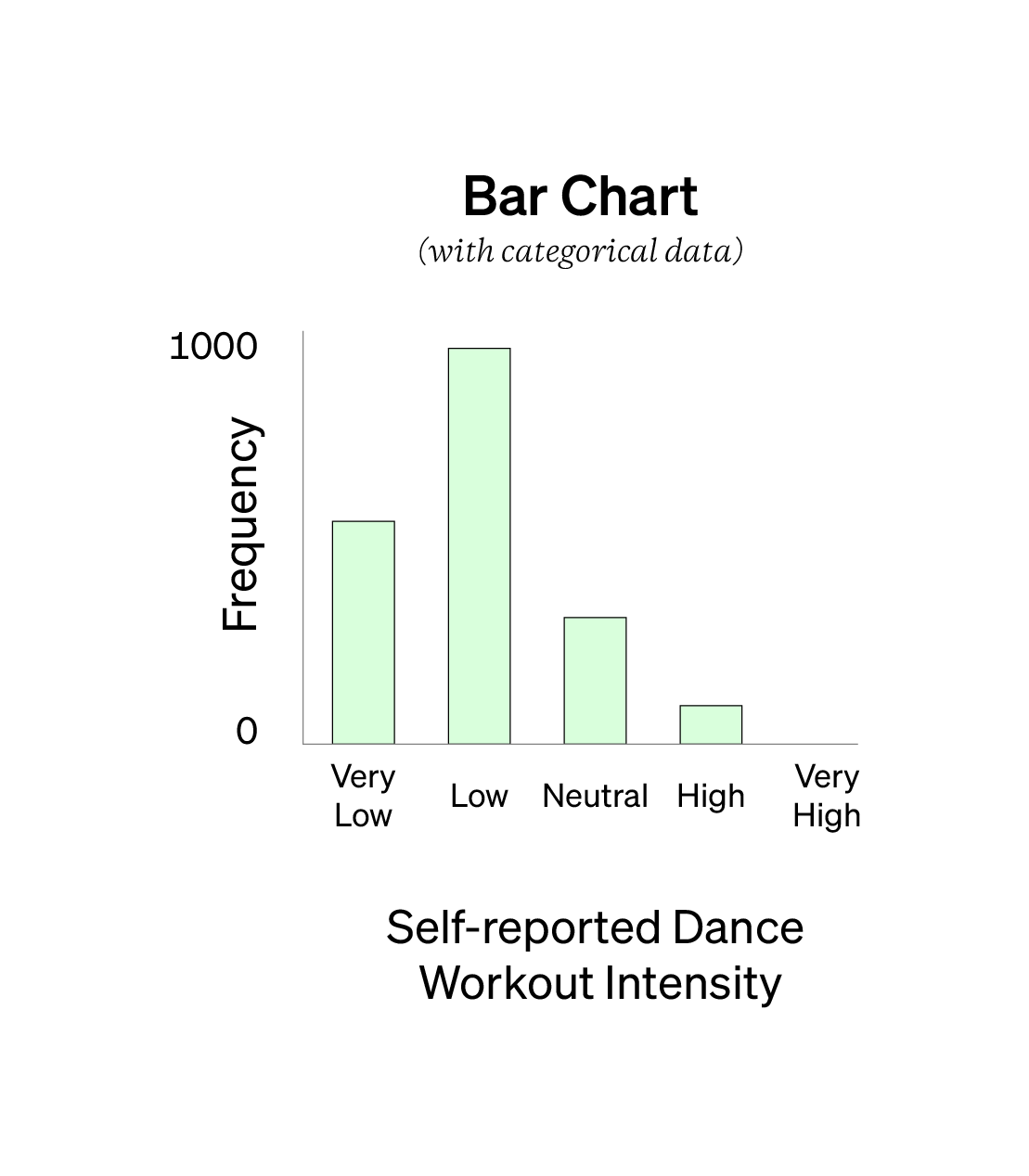
If you’re working with categorical data, the absolute best way to make sense of it is with a bar chart. It’s the simplest and most effective way to see patterns in categorical data. You’ll likely end up collecting a ton of categorical data in much of your quantitative studies.
To become a better experience researcher, get good at describing and visualizing categorical data.
Getting good at working with, manipulating, and visualizing categorical data will help you become a more confident, proficient quantitative experience researcher.
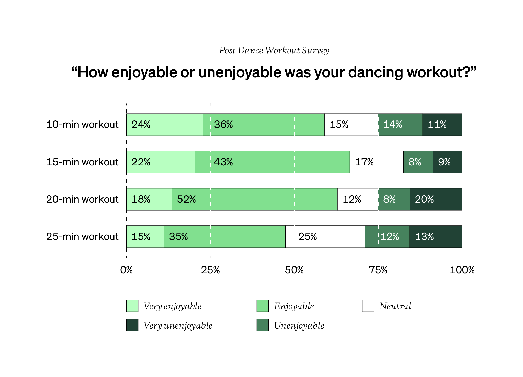
Two bar charts are particularly useful in experience research: the grouped and stacked bar chart.
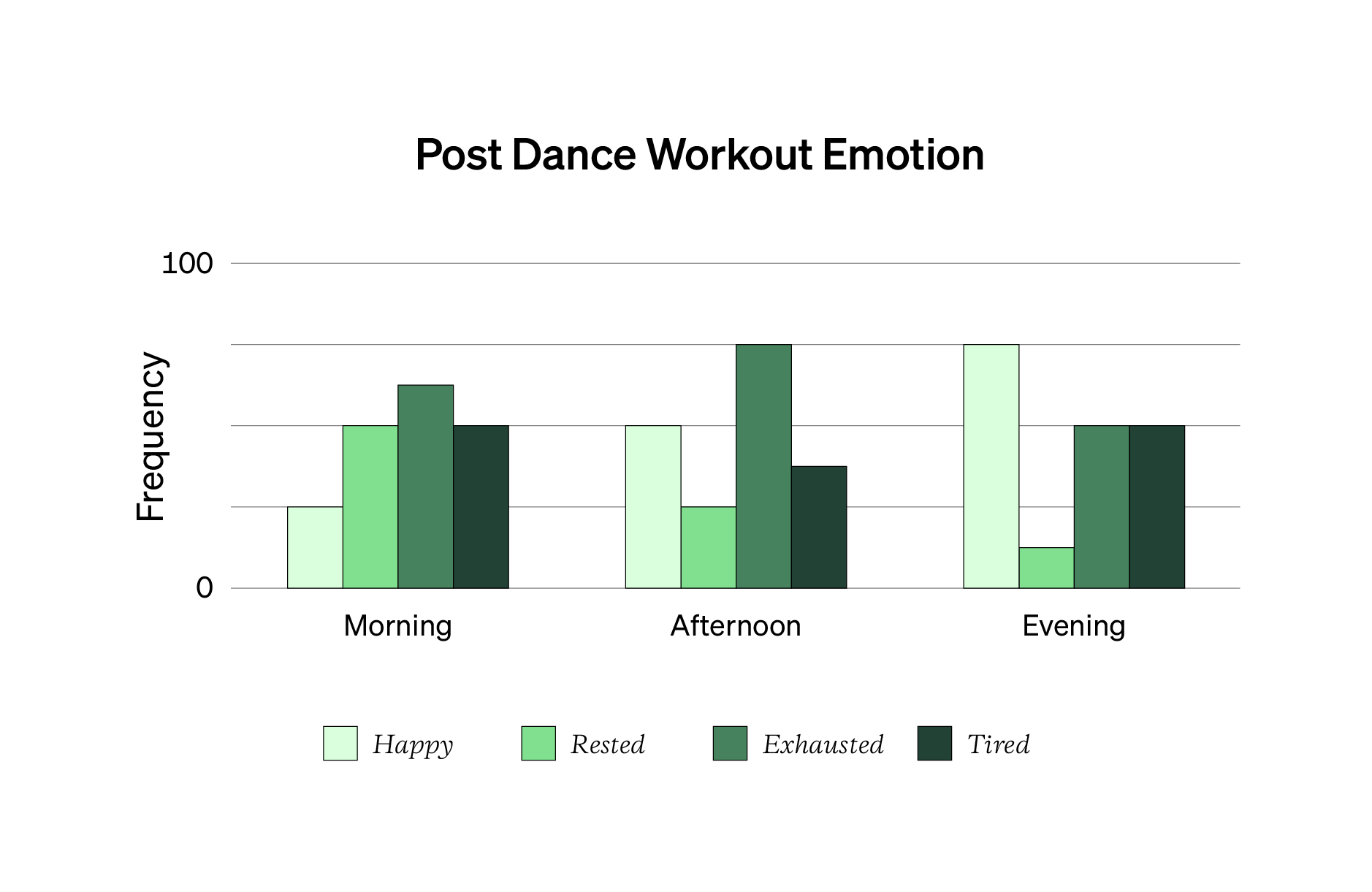
A grouped bar chart (below) takes two categorical variables, plots their frequency, and puts them next to each other. The example graph above takes two categorical variables (when someone completes a dance workout and their self-report emotion after the workout) and maps them together. On the vertical y-axis, you see the frequency of each bar. A grouped bar chart is an excellent way to visualize a complex or interesting contingency table.
Another type is the stacked bar chart (above). This is when you take all of the data and place each bar on top of the other. Together, the bars add up to 100%. This is useful when trying to visualize and see patterns across several columns of data like with Likert scale questions (jump to this Topic for more).
Here’s a link for additional help on describing and displaying your categorical data. Note that more complex graphs and displays don’t automatically translate to more value for your stakeholders. Only add in extra detail and variables if and when it helps your stakeholders or audience understand the patterns in your quantitative data faster and more accurately.
Below are questions you can ask yourself when you’re describing, displaying, and exploring your quantitative data. Make sure to log answers to these questions in your analysis journal.
Quantitative Analysis Questions to Ask Yourself
- What does your descriptive statistics suggest or imply about your research question(s) or hypotheses?
- How would your statistics change in 3 months or 3 years? Would any patterns get stronger, weaker, change, or disappear?
- How much variability or dispersion is in your data? What does that mean or suggest?
- Are there any peaks or modes? What other data helps explain why there’s a peak or mode?
- Are there any trends within one variable or across variables?
- Is there a direct or inverse relationship among variables? Do low or high values of one variable have similar low or high values in another? Why or why not?
- What data or patterns did you expect? Are there any reasons for the lack of this data or pattern you can see or check for?
- Can you split your data by different segments or groups of participants? How do patterns change when you focus on a specific segment or group of participants? Why?
- Are there outliers? Are they high or low? What are the other variables associated with this outlier and how does it compare to the non-outlier data? What happens to your descriptive statistics when the outlier is removed?
- How do patterns /results work with or against other trusted or credible data sources?
- What findings are based on small, limited, unrepresentative, or uninformative participants?
- If you replicated the study, what patterns would you expect to stay the same or different? Why? How do you know?
- What stays consistent as you move from one variable or column to the next? Why do you think that is?
- Do your significance tests produce statistically significant results? Are any significant results practically significant?
The last questions in the list have to do with statistical significance. Let’s break down what it means in the next part and why practical significance is even more important to consider.
- Descriptive statistics
- Central tendency
- Measures of dispersion
- Measures of position or rank
- Bar graphs; histograms
- The four moments of statistics